-
What Is A Responsive Website?
Website visitors are using an increasing variety of devices, from smart phones, net books, and tablets to desktop PCs and home theatre displays. This trend is not going away and it poses a question for web developers, “How can we make the user experience equally good on as many different devices as possible?”
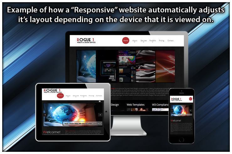
When we ask, “Is a site mobile-friendly?” we don’t mean, “Is the site visible on mobile phones?” What we want to know is, “Does the site offer a good user experience on a small screen?” Many (if not most) websites still require the user to repeatedly zoom in and out in order to navigate on a mobile phone. This does not equate to a good user experience.Responsive Web Design is an approach to web design aimed at allowing desktop webpages to be viewed differently in response to what device they are being viewed on. A responsive website keeps the same content whether you are viewing it on a 27" desktop monitor or a little old iPhone4. The website is coded in such a way that it automatically detects the screen size and resolution that it is being viewed on, and automatically and instantly adjusts its viewable layout to give the person viewing the site an optimal browsing experience. What may be a beautiful full website on a large desktop monitor would be horrible to view on a small handheld smartphone screen. In this case, your website would instantly detect that the viewer is using a small 400 pixel iphone screen rather than a huge Ultra HD 28" desktop monitor. It would then instantly rearrance, adjust, and condense your site down to 1 single scrollable column for your phone, which would then also rearrange itself to look completely different on the slightly larger screen of a tablet. Essentially, your website has "responded" to what the end user is viewing it on, hence the term "responsive" website